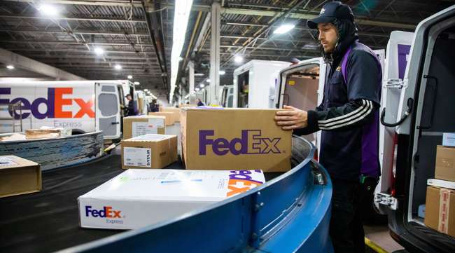
Want success? Use the FedEx logo everywhere you can!

The Power of the FedEx Logo: More Than Just a Delivery Symbol
The FedEx logo is a prime example of effective branding in the corporate world. It is not merely a visual identifier for a global shipping and logistics company; it embodies the essence of the brand itself—speed, efficiency, and reliability. Here at Rupiani's, we embrace FedEx as one of our shipping carriers of choice for nationwide shipments. Let's take a closer look at the elements that contribute to the logo's powerful impact.
Simplicity and Clarity
At first glance, the FedEx logo appears straightforward, featuring the name "FedEx" in a bold, sans-serif font. This simplicity is a key strength. In a world overwhelmed by complex designs and cluttered imagery, the FedEx logo stands out for its clarity. This direct approach communicates professionalism and trustworthiness, essential qualities for a company that delivers critical packages worldwide.
The Hidden Arrow
One of the most celebrated features of the FedEx logo is the hidden arrow formed between the letters "E" and "x." This clever design element represents speed and precision, suggesting movement and forward-thinking—qualities that resonate with the brand’s core mission. The arrow is a masterstroke in visual communication, engaging viewers and inviting them to look deeper into the logo’s meaning.
Color Psychology
The FedEx logo employs a unique color palette, utilizing purple and orange in the standard version. Purple is often associated with luxury and reliability, while orange conveys enthusiasm and energy. This combination not only makes the logo visually appealing but also aligns perfectly with the brand's values. The distinct colors help FedEx stand out in a crowded marketplace, reinforcing brand recognition.
Versatility and Adaptability
The FedEx logo has proven to be remarkably adaptable over the years. With variations like FedEx Express, FedEx Ground, and FedEx Freight, the logo maintains a cohesive identity while allowing for differentiation among services. This versatility ensures that the logo remains relevant as the company evolves, all while retaining its core identity.
Global Recognition
The FedEx logo is one of the most recognized symbols worldwide. It transcends language and cultural barriers, making it instantly identifiable to consumers and businesses alike. This level of recognition is a testament to the logo's design, as well as the effectiveness of FedEx's marketing strategies over the years.
Conclusion
The power of the FedEx logo lies in its simplicity, clever design elements, effective use of color, and adaptability. It not only serves as a brand identifier but also encapsulates the company's mission and values. In a competitive industry, the logo stands as a beacon of trust, efficiency, and global reach, demonstrating the profound impact that thoughtful design can have on corporate identity and brand loyalty. As FedEx continues to innovate and expand, its logo will remain a powerful symbol of its commitment to excellence in logistics and customer service. Who knows, we love their logo so much that we may plaster it all over our homepage one day!